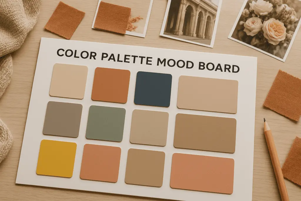
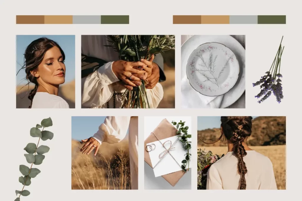
What Is a Color Palette Mood Board?
A color palette mood board helps designers start with clear colors, strong branding, and a focused vision. A color mood board works as a guide that supports fast design decisions and keeps teams aligned across projects, plans, and workflows. Designers use these boards to view images, gather inspiration, and shape the early creative process.
A palette board brings ideas together in one place. You create it to show mood, tone, and direction. It helps teams understand the story of a collection, choose smart colors, and save time during development. Mood boards also help designers make informed purchase decisions when selecting fabrics or patterns for their projects, ensuring that every material aligns with the intended design and overall wardrobe goals. Most brands also share mood boards with business partners, social media accounts, and creative teams, since clear visuals enhance communication.
How Color Palettes Shape a Fashion Collection
A strong color palette drives the identity of every collection. Designers start with a theme and select colors that support it. This approach keeps the design easy to follow and consistent.
Story
A palette communicates emotion. Designers choose warm tones for comfort or bold tones for energy. The story stays strong when colors support every look.
Focus
A collection needs clarity. Designers apply one main direction and allow accents to guide detail choices.
Market Trends
Designers search for trend reports to learn which colors rise each season. They use ads, videos, and runway photos to view what works today. Seasonal mood boards help visualize how colors and fabrics work together before committing to a project.
Brand Identity
Color branding helps customers find and love a style. A consistent palette makes a brand easy to view, read, and recognize across social media accounts, services, and ads.
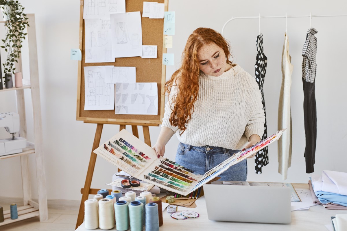
The Designer’s Method: How to Build a Perfect Color Palette
Designers follow simple rules to create a balanced palette for any collection. A strong mood board should include a defined palette of core colors and neutral shades, images, textures, key words, and inspiration references. Mood boards can be created using templates that simplify the design process for users without design skills.
Base Colors
These shades carry the main tone. They act as the foundation of the entire collection.
Accent Colors
Accent shades enhance the base. They offer variety without chaos.
Neutrals
Neutrals bring space, calm, and clarity.
Pop Tones
Pop tones add excitement. Designers apply them in small areas to keep balance.
The 70–20–10 Rule for Colors
- 70% base colors
- 20% accents
- 10% pops
The 6–3–1 Color Rule
- 6 versatile everyday shades
- 3 strong accents
- 1 hero color with impact
Simple Palette Template
|
Category |
Purpose |
Examples |
|---|---|---|
|
Base Colors |
Structure |
Navy, Olive, Burgundy |
|
Accent Colors |
Dimension |
Coral, Sage, Amber |
|
Neutrals |
Balance |
Cream, Gray, Sand |
|
Pop Tones |
Energy |
Lime, Fuchsia, Electric Blue |
How to Create a Color Mood Board
Primary color palettes define a project’s energy, and textures enhance the tactile quality of the design. Effective mood boards require a clear narrative and the project’s emotional tone to ensure thematic consistency. Here is a quick process to create a beautiful board:
- Start with a theme and mood words.
- Find images from runways, nature, and material photos.
- Select a palette based on emotion and brand choice.
- Save colors in a library for easy future use.
- Use your mood board to guide the purchase of fabrics or patterns that match your chosen palette.
- Continue refining until the vision feels right.
- Share it with your team through email, video, or direct link.
You can visit Wave PLM’s mood board guides for deeper steps. Designers often read, view, and continue learning from advanced creative examples.
Sources of Color Inspiration
Runways
Runways show clear seasonal directions.
Nature
Forests, oceans, and minerals inspire texture and depth.
Culture
Festivals, crafts, and traditions influence unique palettes.
Materials
Fabric behavior shapes how colors appear.
Trend Forecasting
Pantone and WGSN offer expert insight into seasonal ideas.
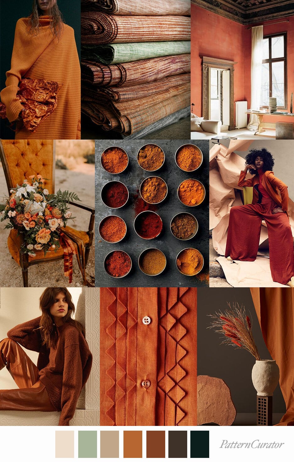
Real Examples: 5 Popular Palette Types
Seasonal Palette
Fresh pastels for spring and rich earth tones for fall. For example, soft whites, blush pinks, minty greens, and pale pinks are popular colors for spring mood boards.
Minimalist Palette
Clean neutrals like beige, white, and stone.
Luxury Palette
Deep jewel tones that signal richness.
Streetwear Palette
High‑contrast brights with dark anchors.
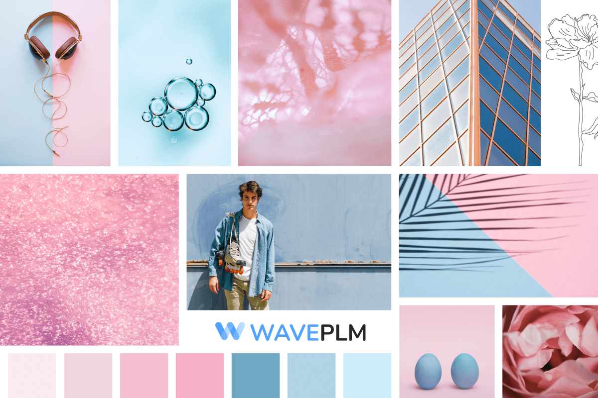
Pastel Palette
Soft blends that feel calm and dreamy.
Quick Comparison Table
|
Palette Type |
Mood |
Key Colors |
|
Seasonal |
Fresh or earthy |
Blush, Rust, Forest |
|
Minimalist |
Calm |
Black, White, Beige |
|
Luxury |
Bold |
Emerald, Gold, Ruby |
|
Streetwear |
Energetic |
Neon, Black, Red |
|
Pastel |
Light |
Mint, Lilac, Peach |
Collaboration and Feedback: Working with Teams and Clients
Collaboration and feedback are at the heart of successful design projects. Mood boards make it easy for designers to share their color palette and creative ideas with teams and clients, ensuring everyone is aligned from the start.
Using online tools, designers can create and update mood boards quickly, making it simple to adjust the palette as the project evolves. This not only saves time but also ensures the final design truly reflects the client’s business goals and brand identity. By keeping the process open and collaborative, designers build stronger relationships with clients and teams, leading to more effective and beautiful design outcomes. Sharing boards and gathering feedback is a key step in turning creative ideas into a collection everyone is proud of.
Designing for Different Mediums: Digital, Print, and Beyond
Every design project has its own unique requirements, especially when it comes to the medium. Mood boards help designers create a color palette that works perfectly for digital screens, print materials, or even physical products. For digital projects, designers focus on colors and images that look vibrant and consistent across devices, ensuring the palette enhances the user experience online. In print, the process shifts to selecting colors that reproduce accurately on paper, taking into account how inks and materials affect the final look.
By tailoring mood boards to each platform, designers can feature the right images, colors, and design elements for every context. This careful planning ensures that branding remains strong and recognizable, whether it’s viewed on a website, in a magazine, or on packaging. The process of adapting boards for different mediums helps designers create cohesive, effective designs that enhance the brand’s story everywhere it appears.
Digital instruments like Canva and Coolors can help you with that. For example, Coolors allows users to generate color palettes with up to 10 colors. Coolors offers over 10 million ready color schemes for users to choose from. Users can save unlimited color palettes and colors using Coolors.
Canva provides free mood board templates that can be customized easily. It allows users to upload images or choose stock photos for their mood board templates. Users can collaborate on mood board templates in Canva by inviting others to access their design.
Adobe Express offers a free mood board template for users to create their designs. Our Wave PLM software has its own Adobe Illustrator plugin, which helps users save colours seamlessly into the PLM libraries.
Social Media and Design: Sharing and Promoting Your Palette
Social media accounts are powerful tools for designers to share and promote their mood boards and color palettes. By posting boards and palettes online, designers can showcase their creative process, attract new clients, and gather inspiration from a global audience. Sharing your work on platforms like Instagram or Pinterest not only increases visibility but also invites feedback and engagement, helping you refine your design and connect with other creatives.
Many social media platforms offer features that enhance the design process, such as built-in palette generators, design communities, and easy sharing options. By taking advantage of these tools, designers can create beautiful boards, share them widely, and build a strong online presence. To get started, simply visit your favorite platform, explore the design features, and start sharing your mood boards and palettes. This approach helps you grow your network, find new ideas, and keep your design work fresh and exciting.
Finalizing Your Design: From Mood Board to Collection
Turning a mood board into a finished collection is an exciting part of the design journey. This process starts by reviewing your color palette, images, and design elements to ensure everything aligns with your vision. Designers carefully select and apply colors, refine images, and adjust layouts to create a cohesive and beautiful collection that stands out.
As you finalize your design, experiment with different combinations and enhancements to add depth and interest. Once you’re satisfied, save and download your collection for use in various projects, from branding to marketing materials. This step ensures your work is ready to share, present, or implement across platforms. By following this process, you create a polished, professional collection that reflects your creativity and attention to detail, making your design truly memorable.
How Wave PLM Stores Color Data for Designers & Product Teams
Wave PLM helps teams keep clear, organized, and connected color palette data across projects.
Users can also easily cancel their subscription or account with Wave PLM at any time, giving them flexibility and control over their plan.
What Wave PLM Tracks
- Palette versions
- Material color behavior
- Approved seasonal sets
- Codes and standards
Why It Helps
Teams save time and access data from any device. It keeps the process simple and avoids confusion. Designers acknowledge changes fast, continue updates, and accept version notes. Mood boards should avoid clutter by ensuring every element contributes to the narrative and by leaving ample white space.
Example Color Data Table
|
Color |
Code |
Notes |
Season |
|
Deep Navy |
#001F3F |
Works well on wool |
Fall/Winter |
|
Blush |
#F7DDE2 |
Best on silk |
Spring |
|
Neon Lime |
#D4FF00 |
Strong on synthetics |
Streetwear |
Links to previous articles about mood boards
Designers who want deeper skills can read and view more guides. These articles continue to help teams grow:
- “Elevating Design: Mastering the Art of a Professional Fashion Mood Board” (contextual focus on advanced techniques)
- “How to Create the Perfect Fashion Mood Board” (clear step‑by‑step plan)
- “Aesthetics in Design: Mastering the Art of Mood Boards” (supports creative ideas and strong visual planning)
Mood boards help designers improve experience, enjoy creativity, and build a strong future for each collection. If you want more tools, Wave PLM also offers free guides, services, and palette features you can download or use online.
If you continue your design journey, you will understand how boards shape branding, help teams agree, and guide every creative choice. Find new inspiration, apply what you learn, and start your next palette today.
Conclusion
In conclusion, creating mood boards and color palettes is a fun and rewarding process that sparks inspiration and brings ideas to life. With the right tools and resources, designers can create beautiful boards that enhance their brand’s visual storytelling and support a wide range of projects. Whether you’re designing for digital, print, or other mediums, it’s important to tailor your palette and approach to fit each platform’s unique needs.
Inspiration for mood boards can be gathered from platforms like Pinterest, Behance, and Instagram, as well as personal photos.
Sharing your work on social media accounts helps you connect with others, gather feedback, and promote your design services. The key is to continue learning, experimenting, and applying new ideas to your process. Today, designers have access to a wealth of services, features, and inspiration to help them create stunning designs and achieve their vision. By embracing mood boards and color palettes, you can build a strong, recognizable brand and enjoy every step of your creative journey.


Leave a Reply